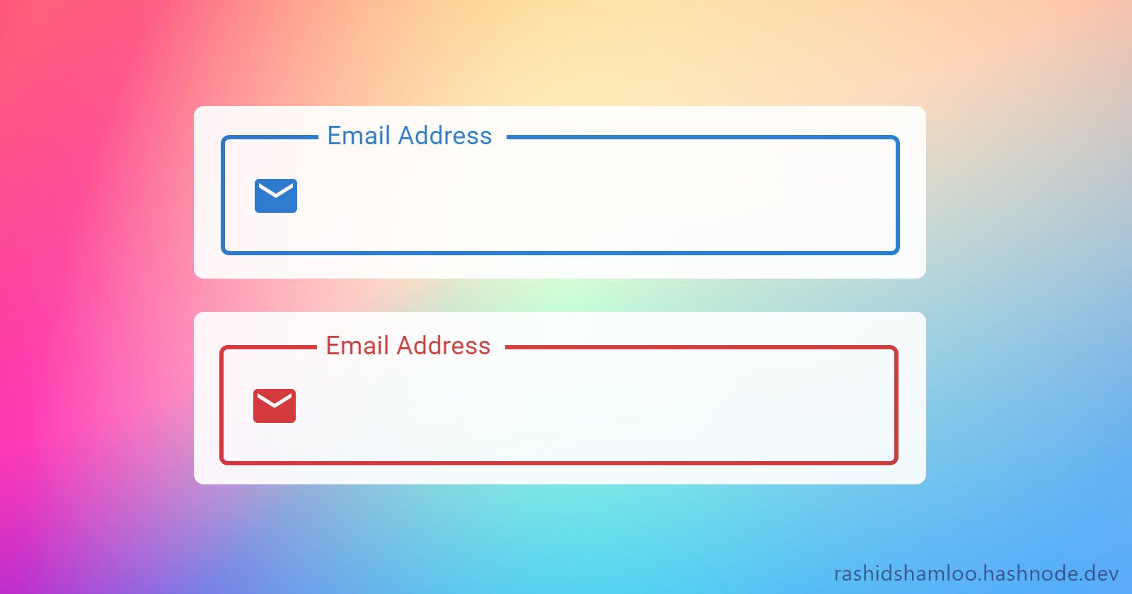
Material UI's Textfield component has a feature where the label is shown inside the input element at first and on focus or when filled, it animates and shrinks to the top. To make a better looking TextField or to add a prefix we can use the startAdornment property to show text or an icon inside the Textfield. However, after doing so, the label will always be stuck in the shrinked position and won't animate anymore (this doesn't happen with endAdornment.)
Controlling the shrink state
To fix the problem, we need to shrink the label manually ourselves when needed. the InputLabelProps property of the TextField exposes a shrink property which allows us to do this. setting shrink to true will shrink and animate the label to the top and setting it to false will make it stay inside the input field.
<TextField
  InputLabelProps={{
    shrink: true/false,
  }}
...
/>
We can use the onFocus and onBlur events to set the shrink state:
const [shrink, setShrink] = useState(false);
...
<TextField
onFocus={() => setShrink(true)}
onBlur={(e) => setShrink(!!e.target.value)}
InputLabelProps={{ shrink }}
...
/>
You can see it working here:
Adding color to the icon
Since the InputAdornment is not a child of the label but of the input field itself, its color won't change when the Textfield is focused or when it has the error property set. To fix it, we can directly target the .MuiInputAdornment-root class and set its color on focus and error:
<TextField
  sx={(theme) => ({
    '& .Mui-focused .MuiInputAdornment-root': {
      color: theme.palette.primary.main,
    },
    '& .Mui-error .MuiInputAdornment-root': {
      color: theme.palette.error.main,
    },
  })}
  ...
/>
Working example:
Fixing the outline
When using the outlined variant of the Textfield, the placement of the empty space that holds the text is wrong. We can fix it by modifying the px in sx property of the .MuiOutlinedInput-notchedOutline class:
<TextField
  sx={(theme) => ({
    '& .MuiOutlinedInput-notchedOutline': {
      px: 5.5,
    },
  })}
  ...
/>
Final version:
🎉 Congratulations, now you have a working and cool-looking Textfield with startAdronment!
