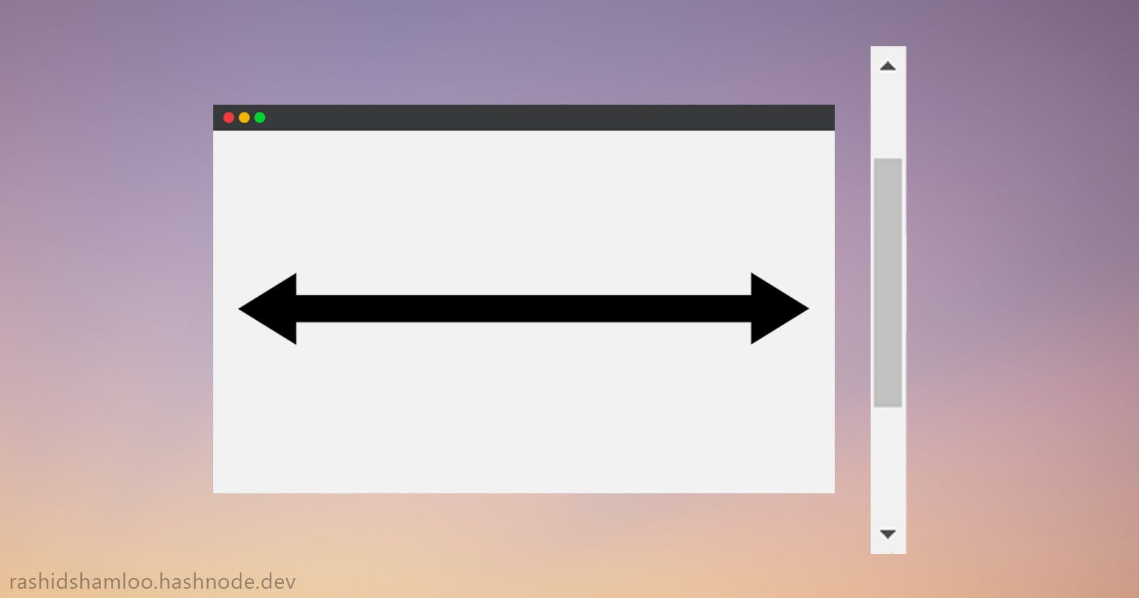
The Problem
When content overflows the page and the scrollbar shows up, the content is pushed/shifted to the left and vice versa, when the scrollbar disappears, the content is pushed/shifted to the right:
This annoying layout shift can be prevented in multiple ways. In this article, I will go over them one by one:
1. Always showing the scrollbars
This is the easiest and ugliest solution.
body {
  overflow-y: scroll;
}
2. The scrollbar-gutter property
The scrollbar-gutter property has been made for this exact purpose. setting it to stable will preserve the space for the scrollbar and prevent the layout shift.
html {
  scrollbar-gutter: stable;
}
BUT... it doesn't work in Safari and the scrollbar track will always be visible on your page which is not desirable.
*. A little note about 100vw and 100%
Before continuing to the next points, it is necessary to understand the difference between 100vw and 100%:
100vw : Full width including the scrollbar.
100% : Full width excluding the scrollbar.
3. Shifting the content to the right
When the scrollbar is not showing, 100vw and 100% are equal, and when the scrollbar is showing, the difference between them is equal to the width of the scrollbar.
So if we shift the content to the right by the difference of 100vw and 100%, we can prevent the layout shift. To achieve it we can use padding-left on the parent/container element:
.container {
  padding-left: calc(100vw - 100%);
}
4. Positioning inside a 100vw width parent
Since scrollbars don't affect the vw unit, we can fix the problem by setting the width of the parent/container in the vw unit and centering/positioning our elements inside of it:
.container {
  width: 100vw;
  /* elements inside won't be affected by scrollbars */
  display: flex;
  align-items: center;
  justify-content: center;
}
The result after applying the 4th method:
